Pando is an entrepreneurial ecosystem based in the mountain community of Park City, Utah. They are a 501(c)3 organization that empowers entrepreneurs, thought leaders and change-makers in the mountains through in-person and online events and programming.
Pando, or “Quaking Aspen”, is believed to be the largest, most dense organism on Earth. This 13 million pound aspen clone spreads over 106 acres in central Utah, consisting of over 40,000 individual trees (USDA Forest Service). Similar to the organism, Pando strives to build connections, bringing individuals, businesses and ideas together in the mountain community.
We at TWIO appreciate the value of a community organization like Pando, and its mission to stimulate entrepreneurial thinking and knowledge-sharing in a region ripe with talent and potential.
- Verbal Brand
- Visual Identity Evolution
- Brand Story
- Website Development
- Explainer Video Development
- Client Testimonial Videos
- Environmental Design
- Digital Marketing

THE OPPORTUNITY
In the Spring of 2021, Pando wanted a rebrand. They reached out to TWIO.
Formerly known as PandoLabs, they wanted to move away from an “incubator” brand identity to one that brings people who love the mountains together, empowering social and economic change for the world. Starting with the Wasatch Back and then expanding beyond into other mountain communities, Pando wants to support the people who live in the mountain communities and connect those who do not, but still desire to be a part of those places.
TWIO led Pando’s verbal rebrand, ensuring its value proposition, mission, vision, values, and positioning resonated with all target audiences and personas. Then we brought this brand strategy to life with a redesign of PandoLabs’ visual identity, including a new website, a name change (“Pando”), new logo, color palette, fonts, etc.
PHASE 1: DOCUMENT AND EVOLVE THE FOUNDATION
Internal Qualitative Research & Interviews — To build the brand foundation, we always begin with internal brand research. By interviewing key stakeholders within the Pando organization, we were able to gain an understanding of who Pando was, and who they wanted to become. Pair that with competitive landscape research and we have a fuller picture of the playing field.
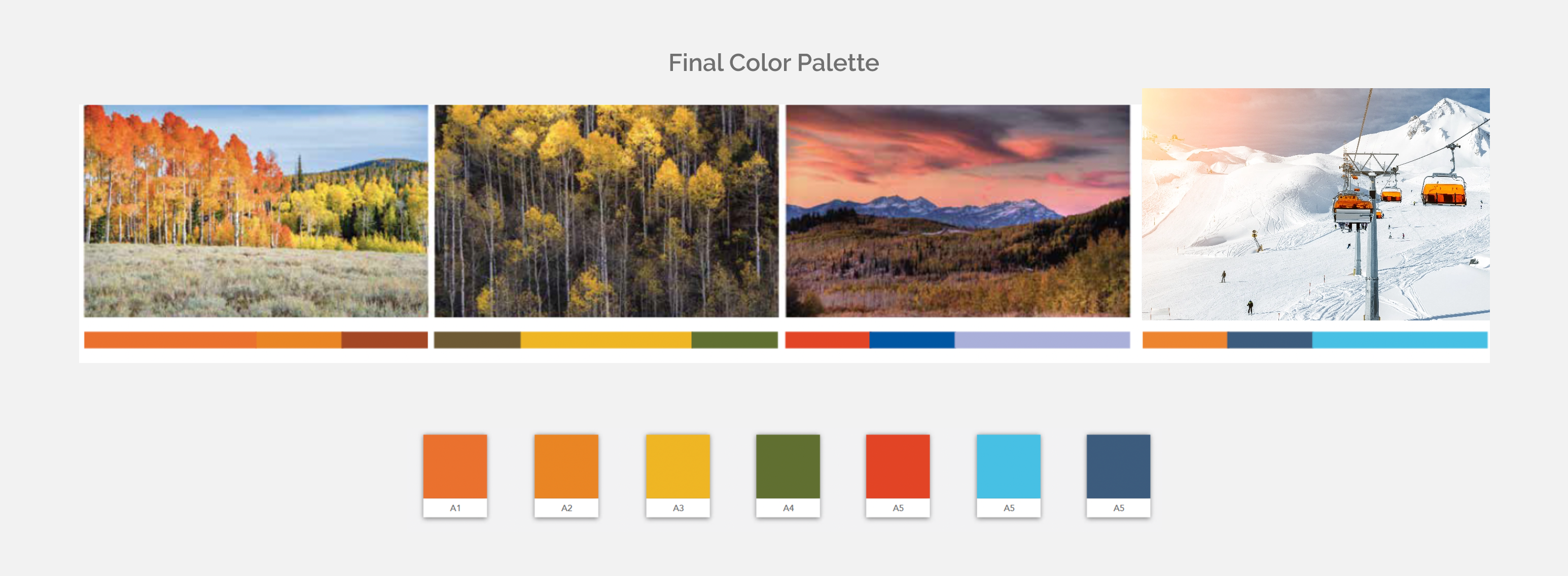
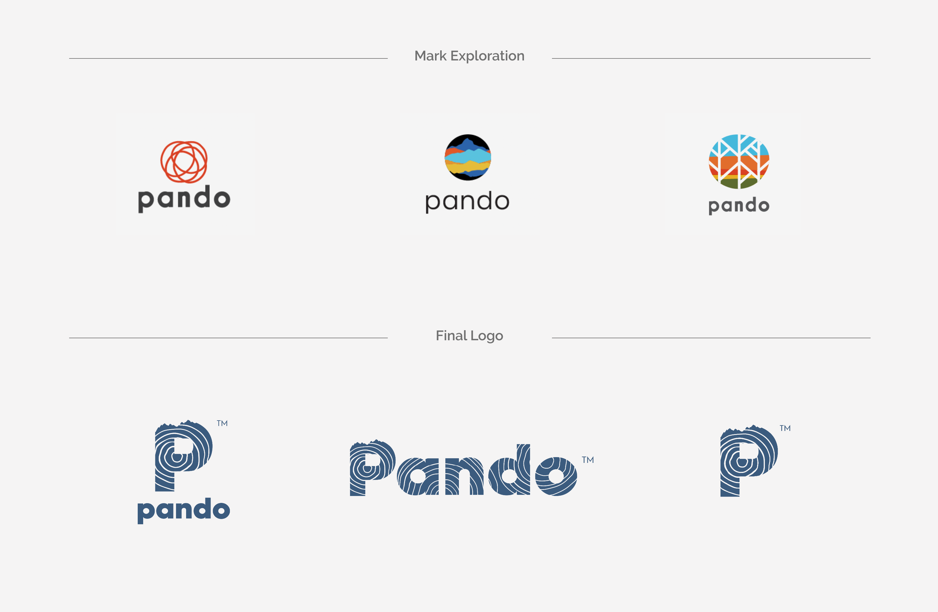
Moodboarding For Design — As we explored and dialed in Pando’s verbal brand (based on its business strategy), TWIO needed to create a visual identity to match. Leadership wanted a more contemporary aesthetic that felt mature and reflective of their members’ surroundings and passions. Our design team explored colors, textures, typography, and symbols that could be used as elements to project a sense of “place”. Utah’s mountains, skies, trees, and tones emerged as major components of the new visual identity.
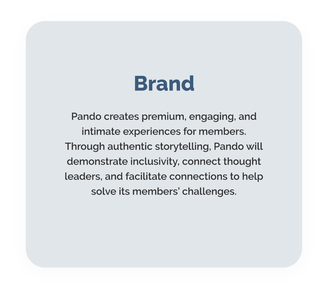
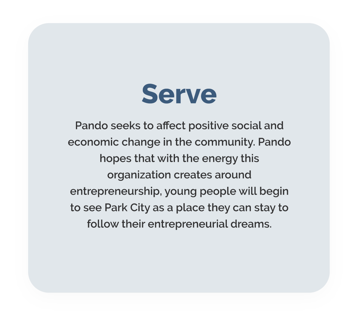
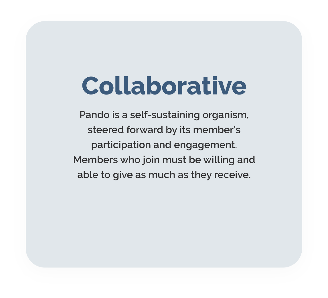
VERBAL BRAND DEVELOPMENT
Through our interview process, we were able to get a clear understanding of Pando’s business and brand objectives. TWIO then built a complete verbal brand system that authentically articulated Pando’s identity.
We developed and documented Pando’s new verbal brand, which included the following Brand Elements:

VISUAL BRAND DEVELOPMENT
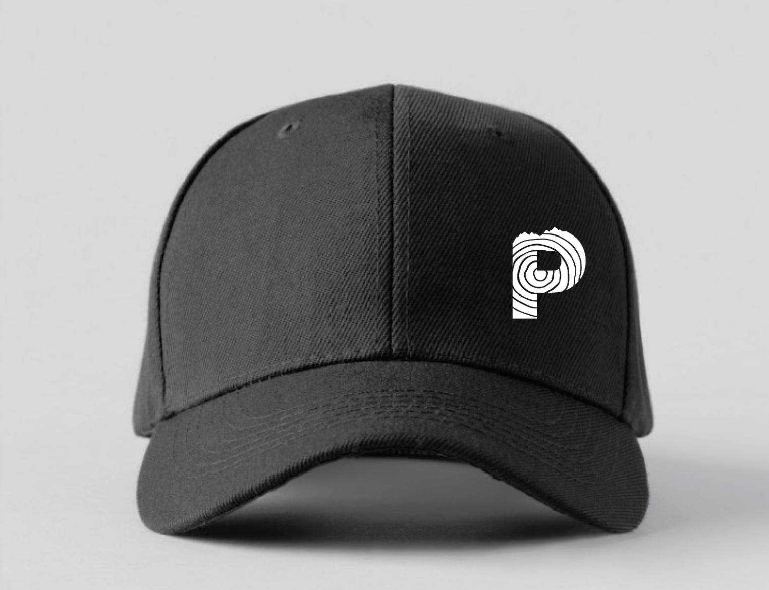
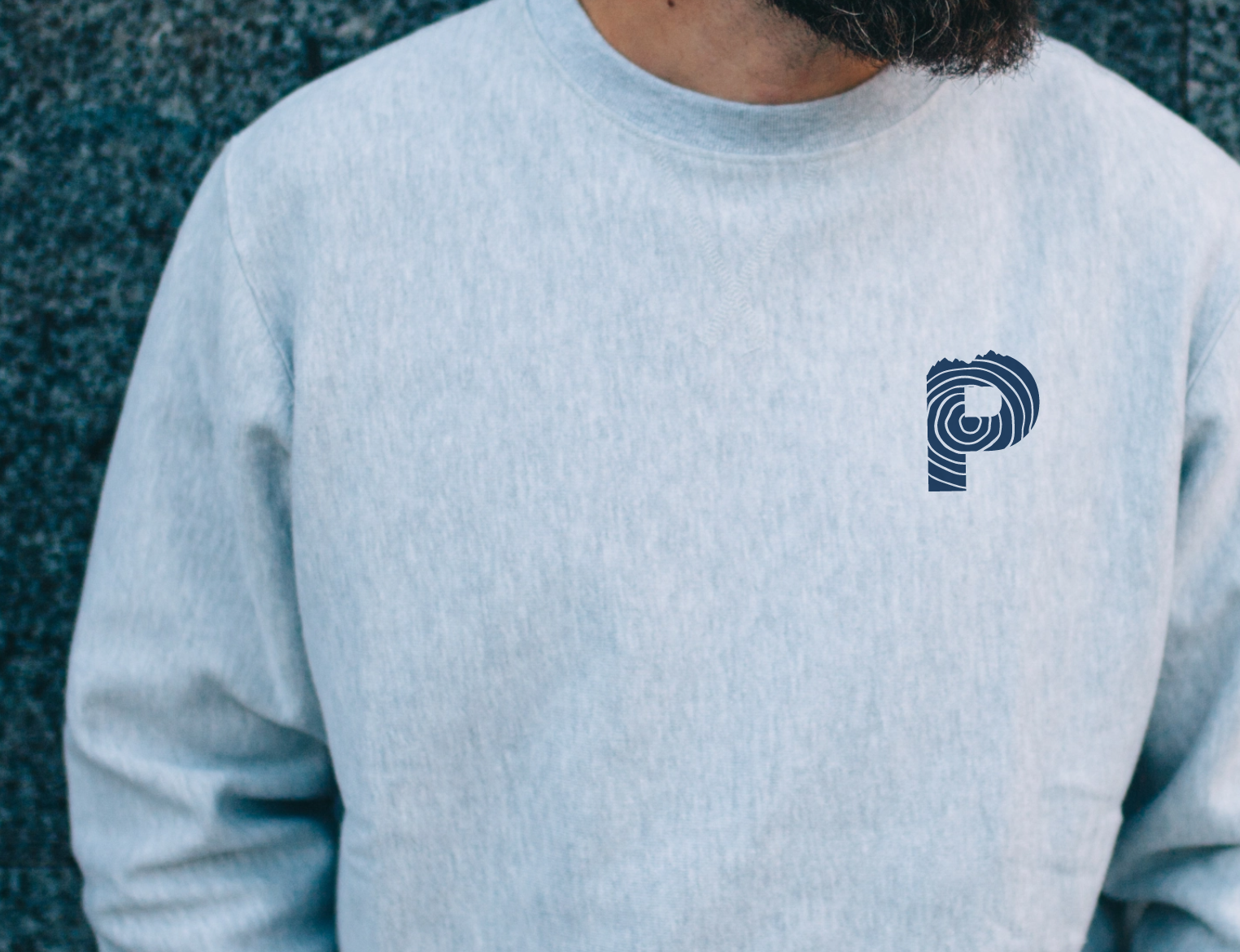
Finally, our creative team—composed of brand strategists, writers, and graphic designers—came together to create a visual identity that brought Pando to life as an organization. Our designers drew inspiration from the Pando organism and Utah’s natural landscape to create a fresh, aesthetically-pleasing visual brand identity. TWIO designers used the lines on the Pando tree combined with topographic lines evocative of Pando’s Park City landscape to create the new aesthetic.
Website Assets • Logo • Wordmark • Symbol • Color Palette • Typography • Swag
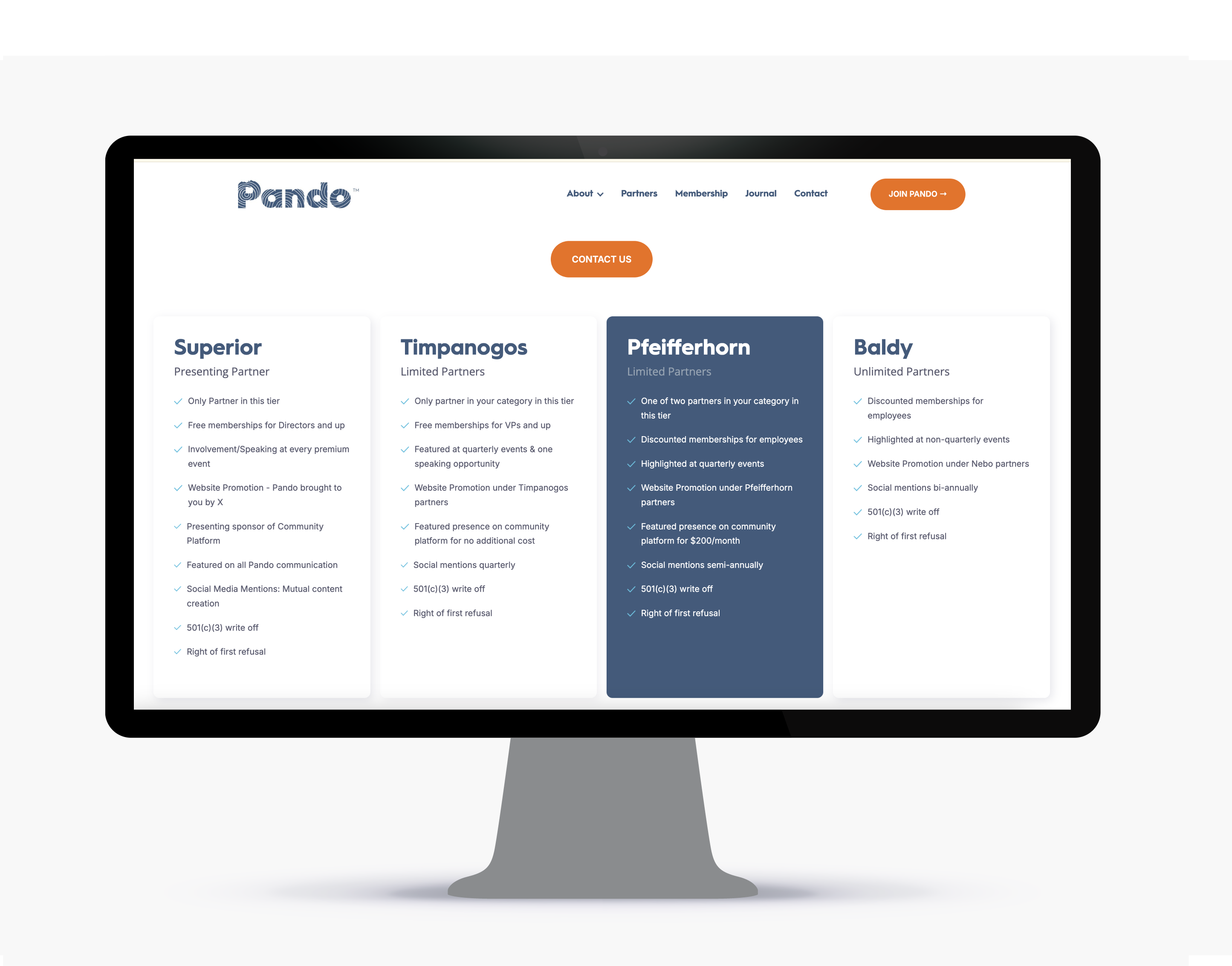
WEBSITE DESIGN
TWIO undertook a comprehensive website redesign to align with Pando’s mission of fostering entrepreneurial connections in mountain communities. The new website features an intuitive navigation system that enhances user experience, ensuring visitors can easily access information about events and programs. The design incorporates visual elements inspired by Utah’s natural landscapes, such as the Pando tree and topographic lines, reflecting the organization’s deep connection to its environment. Additional, the website is fully responsive, providing seamless access across various devices. This redesign effectively communicates Pando’s brand identity and supports its goal of empowering entreprenueurs and change-makers.
MERCH APPLICATION